
Case Study: More menu in app
Outcome: Reduce propensity to contact by 10%
Task: How might we bring the My Account section in to the app?
Customer problem: Difficulty locating items in the “more” menu, particularly around mywaitrose and orders. Frustrated with lack of functionality on app, changing personal settings is easier through the website.
Business problem: Customers not being able to self serve in the app is driving contact volumes to customer care

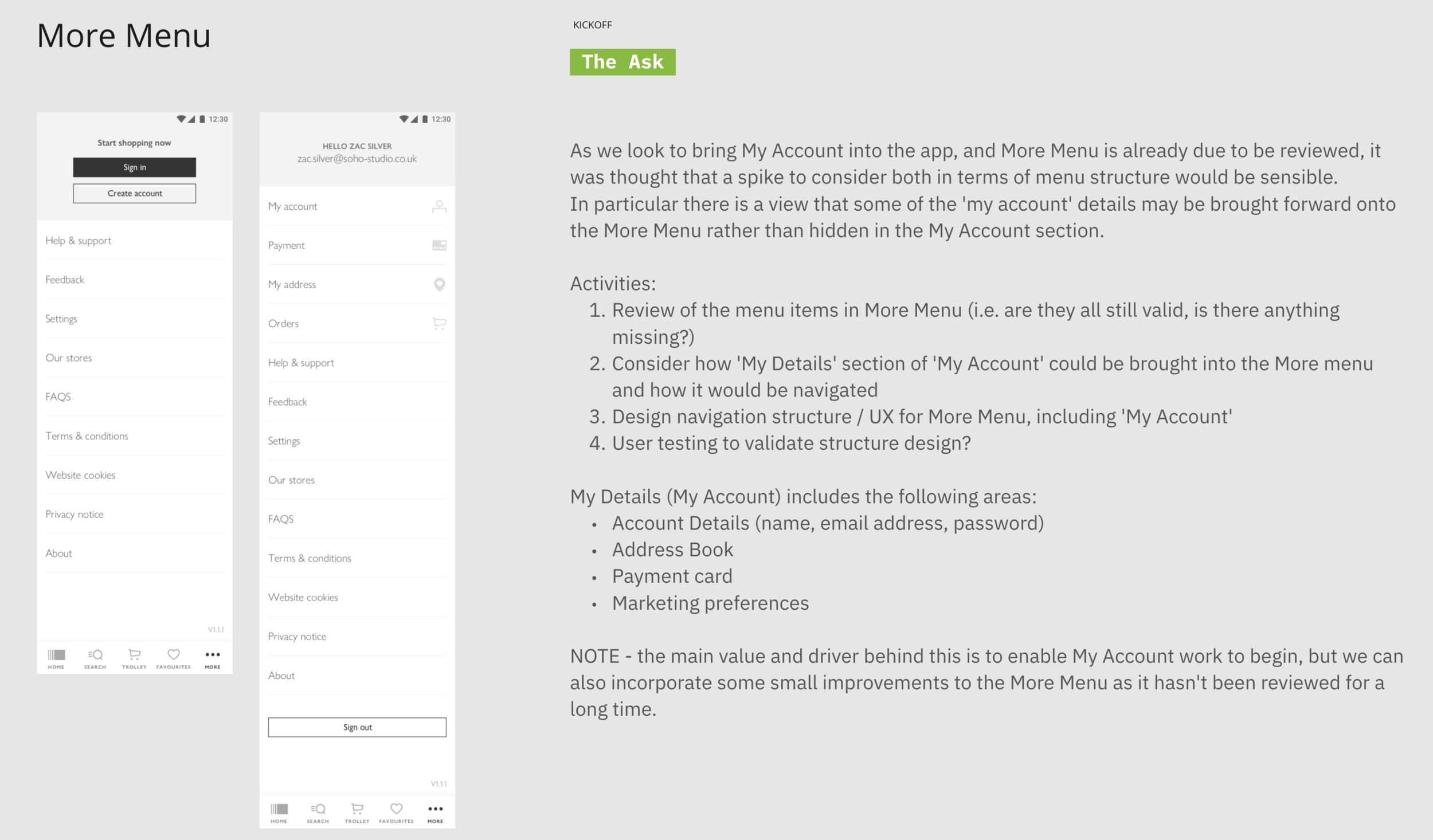
Existing design above - with the majority of content only available through the website this was driving customers out of the app.
Activities:
Review the menu items in More Menu (Arrange card sorts and tree testing)
Consider how 'My Details' section of 'My Account' could be brought into the More menu and how it would be navigated
Design information architecture / UX for More Menu, including 'My Account'
My Details (My Account) includes the following areas:
Account Details (name, email address, password)
Address Book
Payment card
Marketing preferences
Customer verbatim:


Empathise - Customer journeys - starting to understand customer pain points in current more men

Example scenario mapping

Define stage - formalising the problem I have identified, what is my research telling me? Can we group problems by themes? Take the perceived problems and form human centred statements. Start forming “How might we’s”.

Ideating - initial thoughts to previous step, writing notes down to help form ideas

Lo-fidelity wireframes, very early stage designs of what the more menu could look like


Screens mapped out for prototype

Final design for testing, testing questions created and prototype put forward to participants.

